
How to Improve CLS and Prevent Layout Shifts
Learn how to improve CLS by fixing images, fonts, embeds, ads, and dynamic content that cause unexpected layout shifts on your website.
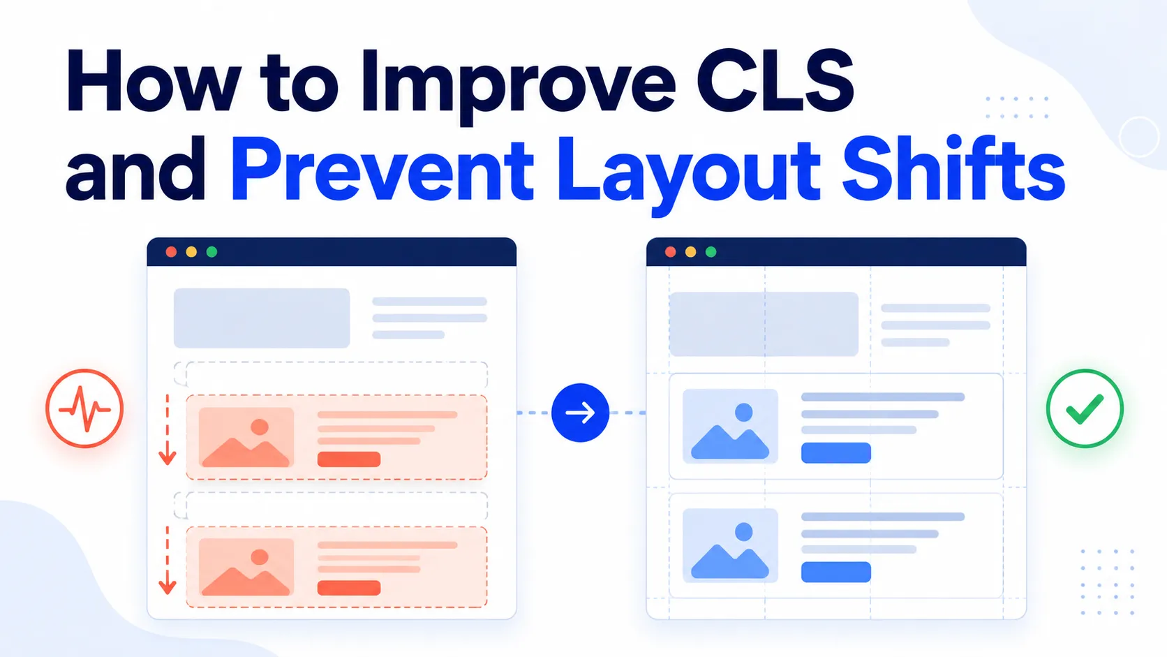
If text moves while you are reading, a button changes position, or an image pushes the rest of a page downward as it loads, your website has a visual stability problem.
These unexpected movements are measured by Cumulative Layout Shift (CLS), one of Google’s Core Web Vitals. A lower score means a more stable experience. Google considers a CLS score of 0.1 or lower good, while a score above 0.25 is poor.
What is CLS?
CLS measures unexpected movement of visible elements during a visitor’s session. For example, an advertisement can appear above a link and move it just as someone tries to click it, or a large image can finish loading and push an article downward.
CLS is evaluated at the 75th percentile of visits, separately for mobile and desktop. It is useful because it reflects what people actually experience, not only how quickly a resource downloads.
Why CLS matters
A page that constantly moves makes reading difficult, causes visitors to lose their place and can lead to accidental clicks. This is especially frustrating on mobile devices. CLS is part of Core Web Vitals alongside LCP and INP, although a good score alone never guarantees higher rankings.
What causes a poor CLS score?
The common problem is that the browser does not know how much space an element needs before it appears. Typical causes include images without dimensions, videos and iframes without reserved space, advertisements, third-party widgets, web-font swaps, banners inserted above existing content, and JavaScript that injects content without a placeholder.
1. Give images explicit dimensions
Use width and height attributes so the browser can reserve the correct aspect ratio before the file arrives:
<img src="example.jpg" alt="Example" width="1200" height="800">The image can still be responsive with max-width: 100%; height: auto. These values describe the proportions; they do not force the image to display at its original size.
2. Reserve space for videos and embeds
Videos, maps, forms and social embeds should have a stable container before their contents load:
.video-wrapper {
  width: 100%;
  aspect-ratio: 16 / 9;
}
This is particularly important for third-party content, whose loading time and final dimensions your site may not control.
3. Keep advertising from moving content
An empty advertising slot that expands after loading shifts everything around it. Reserve the expected space in advance, for example with min-height: 250px. A blank area is less disruptive than moving content that a visitor is already reading.
4. Handle dynamic content carefully
Cookie notices, promotional banners, account messages, search results, recommendations and API responses can all create large shifts when inserted above visible content. Reserve their space before rendering or use a presentation that does not displace the current layout. Skeletons and predictable minimum heights help applications remain stable while data loads.
5. Optimize web fonts
A fallback font and a downloaded web font can have different widths and line heights. When the replacement changes text wrapping, the surrounding layout moves. Choose a compatible fallback, configure font loading carefully and consider CSS metric controls such as size-adjust. Measure before removing a custom font.
6. Prefer transforms for animation
Animating top, left, width, height or margin changes layout. For movement and scaling, prefer compositor-friendly transforms such as transform: translateX(20px), so unrelated content does not have to be repositioned repeatedly.
How to find the cause
Start with PageSpeed Insights, Lighthouse and Chrome DevTools. Field data represents real devices and networks, while lab data is useful for debugging a particular implementation. Test the whole page lifecycle: scroll, open menus, display consent notices, load more content and interact with widgets. CLS problems do not always happen during the first paint.
Will faster hosting improve CLS?
Not necessarily. CLS is primarily a visual-stability metric, so the cause is often in HTML, CSS, JavaScript, media, fonts or third-party services. Faster delivery can change when a resource arrives, but it does not fix a layout that never reserved space. Identify the shifting element before changing hosting.
Common mistakes to avoid
Do not test only on a powerful desktop, rely on one Lighthouse run, assign arbitrary fixed heights, hide symptoms without understanding them, or remove useful content just to improve a number. The goal is a genuinely stable and usable page.
Frequently asked questions
What is a good CLS score?
0.1 or less is good, 0.1 to 0.25 needs improvement, and above 0.25 is poor.
What is the fastest way to improve CLS?
Check images, videos and embeds first. Explicit dimensions and aspect-ratio containers are often quick, high-impact fixes. Then investigate dynamic content, advertisements and fonts.
Does lazy loading cause CLS?
Lazy loading itself does not. CLS occurs when the browser has no dimensions or aspect ratio with which to reserve space for the lazy-loaded element.
Does improving CLS improve SEO?
Core Web Vitals are used by Google’s ranking systems, but CLS is only one signal among many and a good result does not guarantee better rankings.
Build a more stable website
Keep one principle in mind: the browser should know how much space an element needs before it appears whenever possible. Start with images, embeds, advertisements, fonts and dynamic components, then validate the result with both field and laboratory measurements.